CONCEPT WORK
PATTERNED PROJECT
Different cultures have unique motifs and patterns that often go unnoticed. I participated in the Patterned Project as a part of my Portfolio 3 class, and the project was started by my friend Gabe at BYU. The Patterned Project is an effort to bring these beautiful pieces of art to a public space in the form of physical and digital posters. This was an incredibly unique opportunity to represent my parents’ culture through the traditional Filipino Banig, with the project’s objective to familiarize the general population with other cultures through a unique form of art.
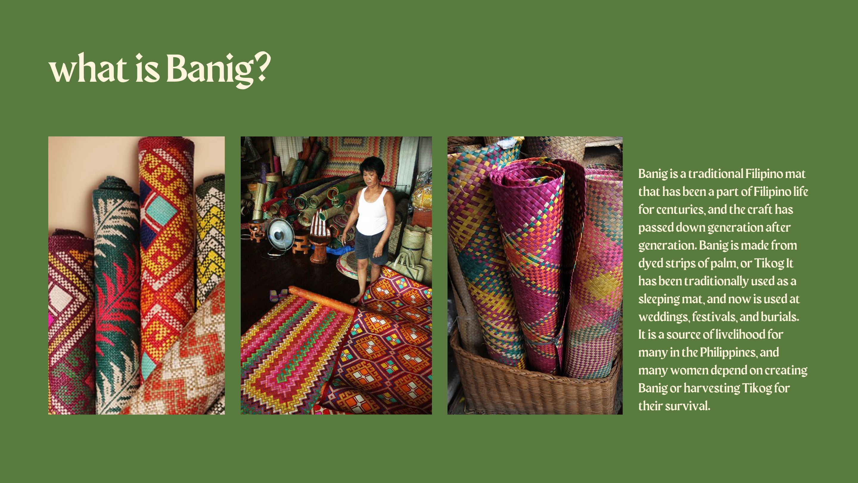


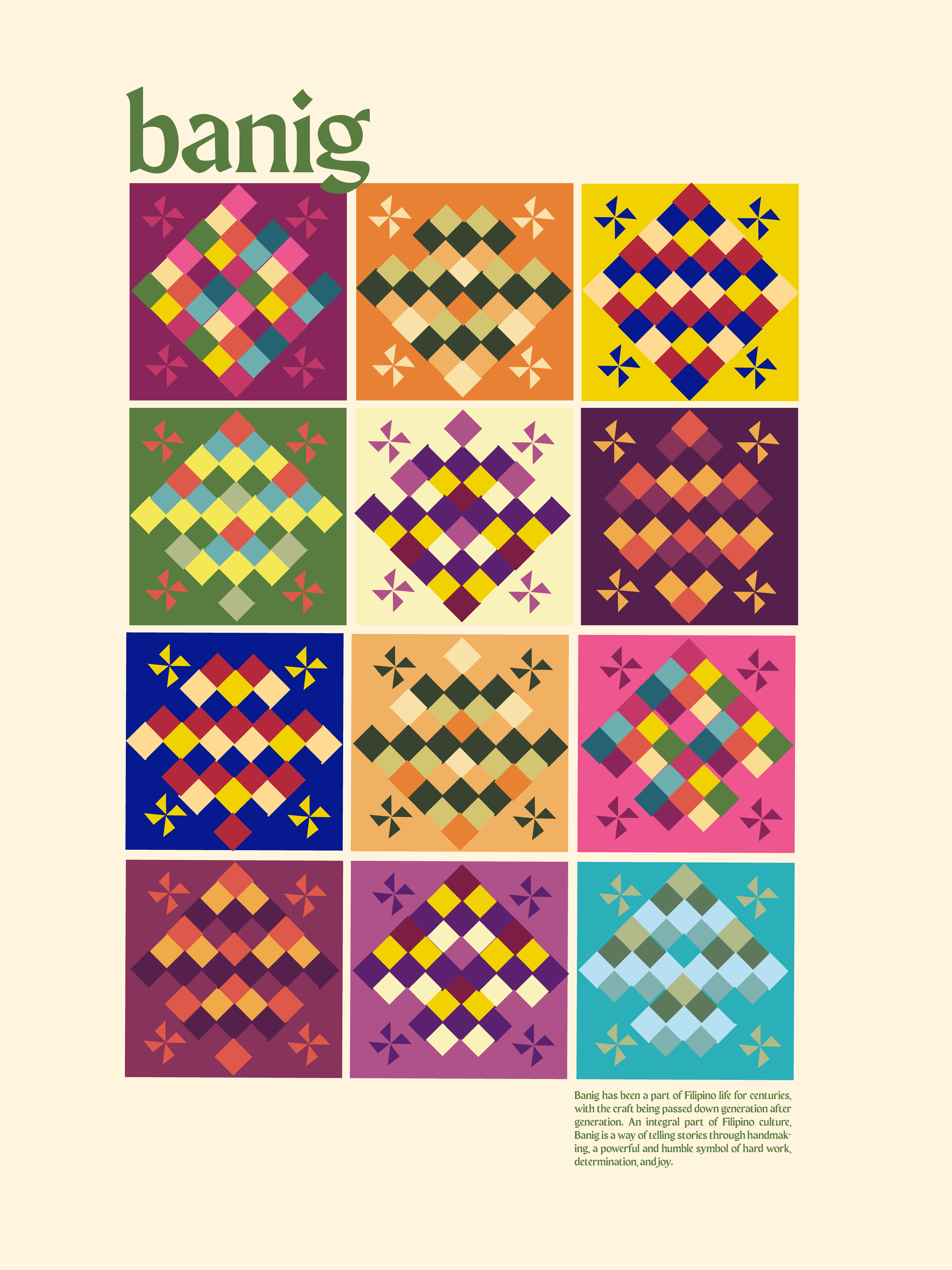
Banig is an integral part of Filipino culture, a very colorful way of telling stories through handmaking, a powerful and humble symbol of hard work, determination, and joy. This has been part of Filipino life for centuries, with the craft has been passed down through generations. I created several patterns with inspiration from filipino culture and life: loud and colorful Filipino jeepneys, markets (palengke) traditional clothing (Maria Clara dresses, hats made of Banig (salakot)), and even got old photos of my grandparents and aunt to include, shown above.
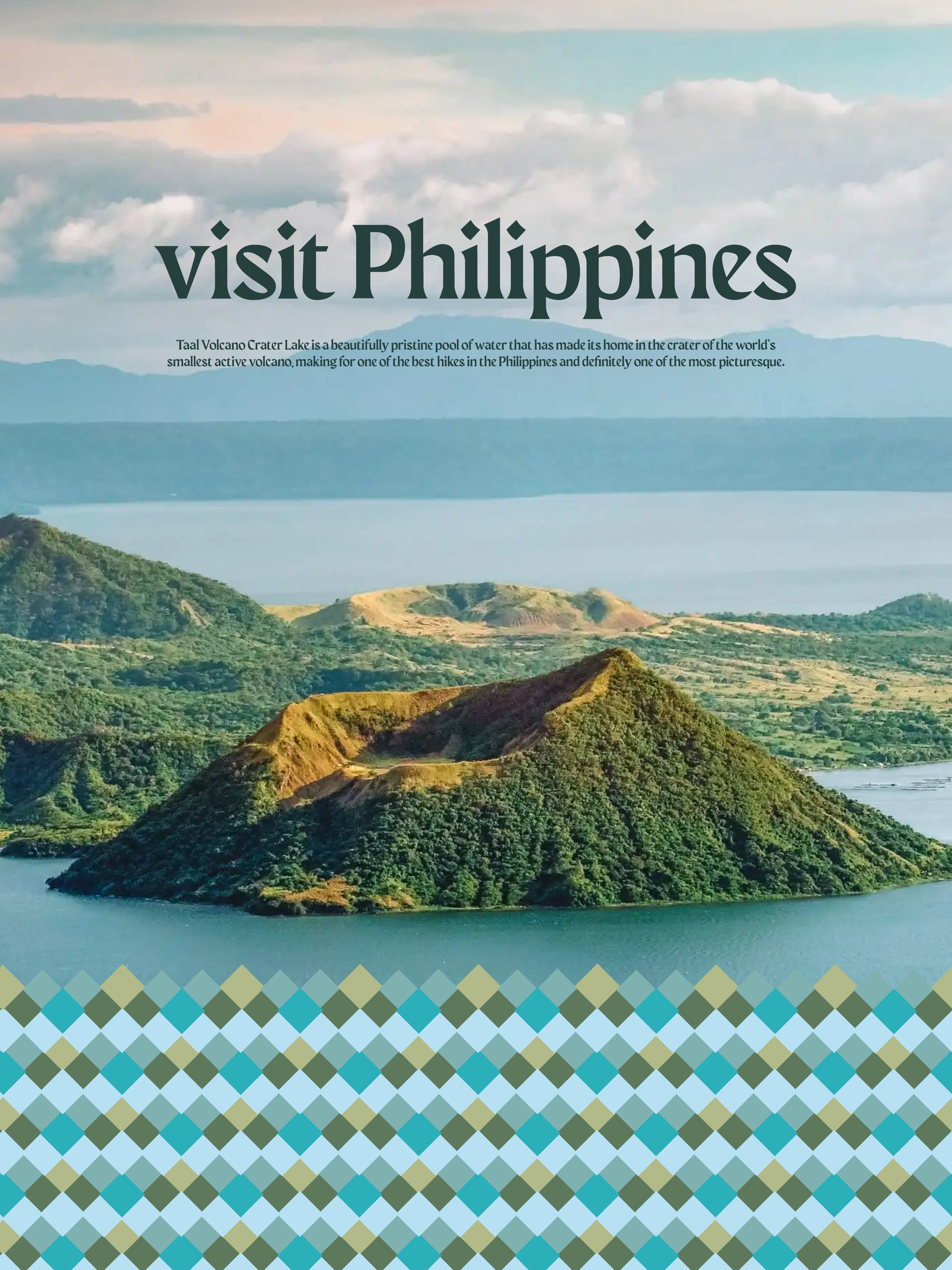
Below are the posters I created, with the left and middle posters explaining the significance of the Banig, and the right, an exploration for advertising.

This was an incredible project that made me feel a lot closer to my heritage and connect with my family’s culture over 9,082 miles away.
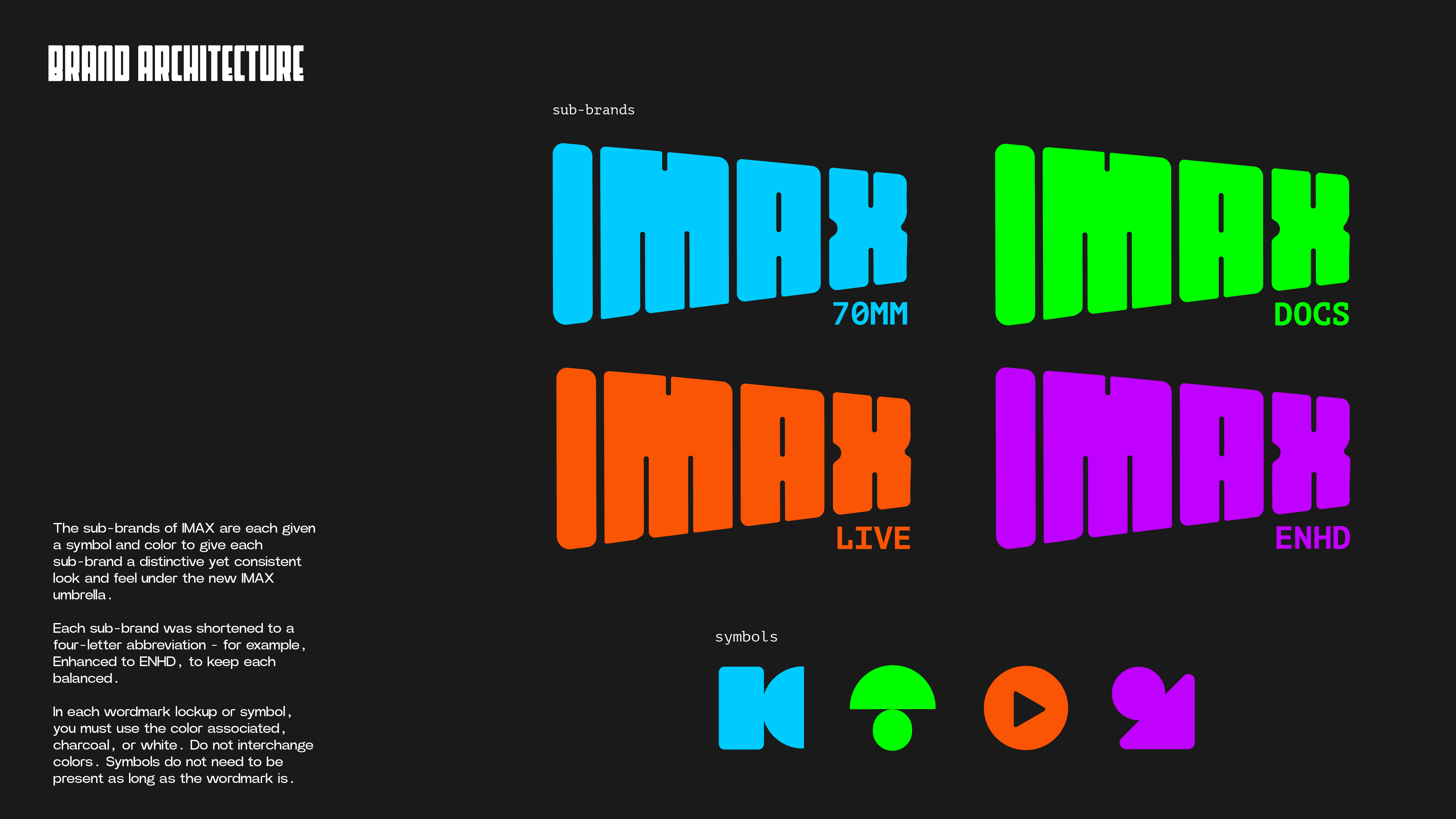
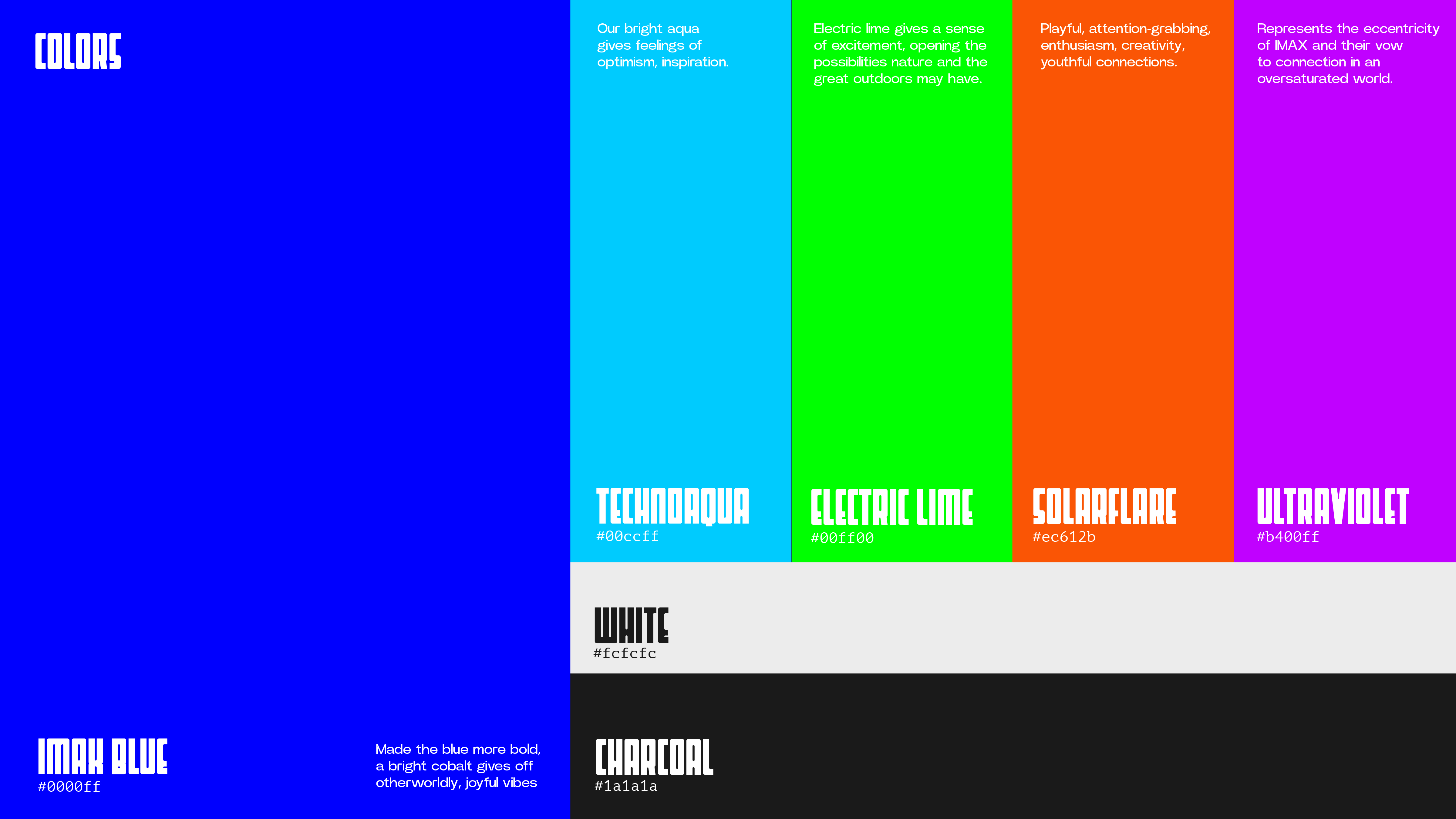
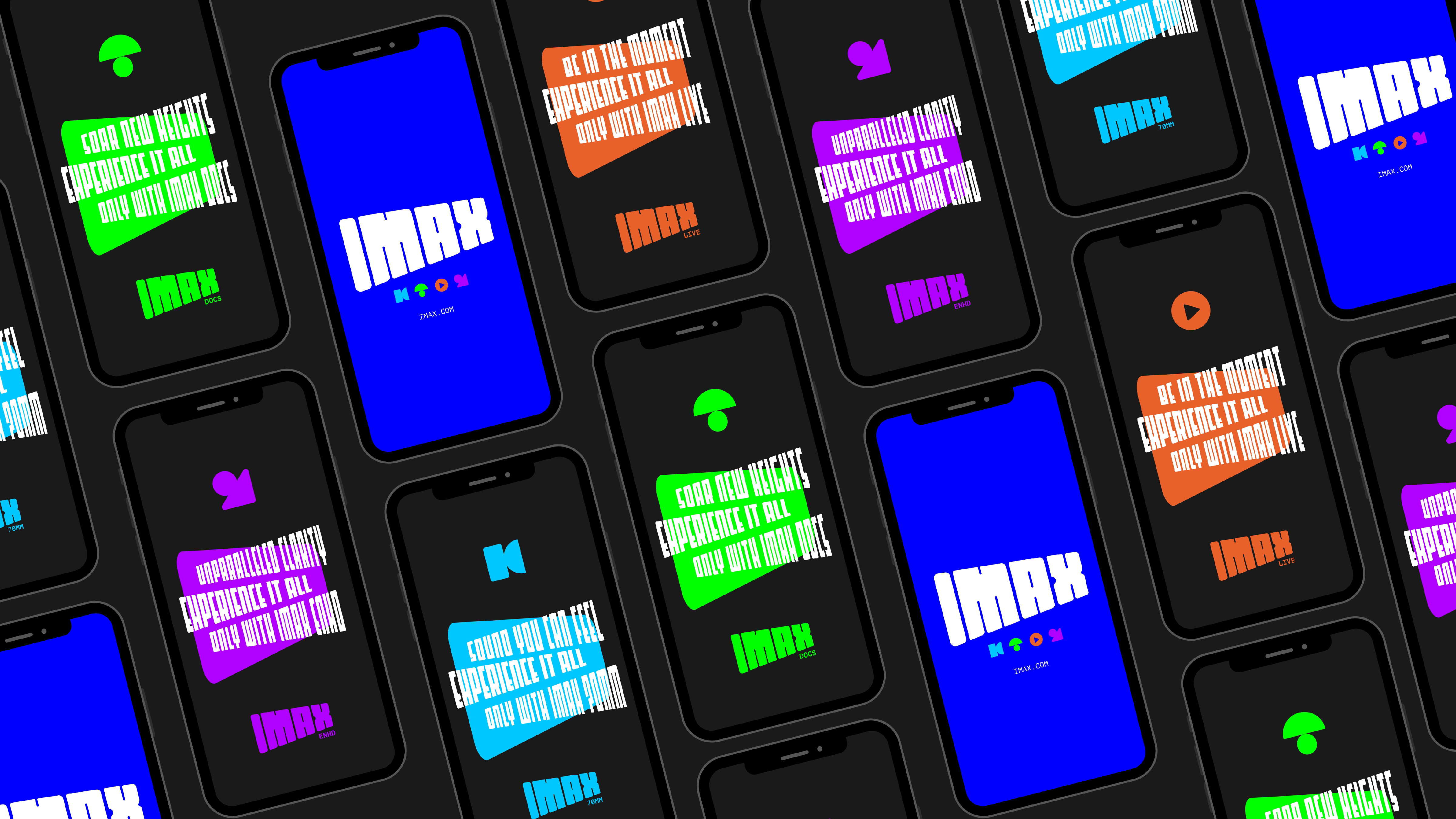
IMAX BRAND IDENTITY
For my Portfolio 3 class, I entered the 2024 D&AD New Blood Awards.
The ask: IMAX needed a brand identity rebrand, and I created a design system that distinguished new and existing IMAX experiences and products, paving the way for IMAX’s future experiences.


AND SHE WAS PACKAGING + BRAND IDENTITY
For my Craft of Visual Communications Class, our client, And She Was, challenged us to create new packaging and brand identity for her jewelry boutique.
And She Was is a curated boutique that offers unique jewelry from diverse backgrounds, for people who are looking to slow down and feel more connected, with handmade objects that inspire others, with powerful stories and artists behind them.
Her primary audience? Middle-aged women (35-65). She doesn’t seek luxury, it just comes to her. She is a woman who wears a lot of hats, a mother, a cook, a traveler, a designer, etc. She appreciates the little things in life. She is on-the-go, well-travelled, and always looking for the next adventure.
When she buys something, it’s for life.

My goal was to bring together people from diverse backgrounds, for people who are looking to slow down and feel more connected, through handmade objects that inspire others, with powerful stories and artists behind them. The packaging needs to reflect what’s on the inside. Handmade objects have so much more meaning than just being material: The packaging must tell a story, showing the dynamic process, the diverse artists, featuring intention and meaning for whatever their new keepsake may be.
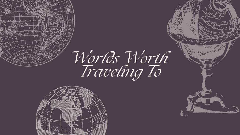
Big Idea: Worlds Worth Traveling To
This concept brings the idea of feeling transported, inspired, and connected through different artists’ work forward through a distinct motif / symbol of travel. The chosen motif of the globe serves as a powerful visual cue, symbolizing not just physical travel, but also the journey of discovery and connection that each piece of jewelry offers. It speaks to the diverse origins of the products while evoking a sense of adventure and exploration. This will elevate the brand experience from the online purchasing process to the moment the customer receives their product. I created two different options to present to our client, a premium and affordable option, so that no matter what her budget is, she can still evoke feelings of discovery, connection, and travel through her pieces.


PANTONE CITY REBRAND
For my Portfolio 3 class, we got to choose briefs to work on, so I chose the 2015 D&AD New Blood Awards brief for Pantone.
The ask: Create a new brand identity for your hometown with color as the focus.


FRIDAY – NON ALCOHOLIC APERITIF
Created beverage packaging as a fun project in my free time.
Wanted to target young adults (18-35) who are interested in health and wellness, love socializing with friends, want to try new non-alcoholic alternatives, but still want to enjoy a sophisticated and flavorful drink.


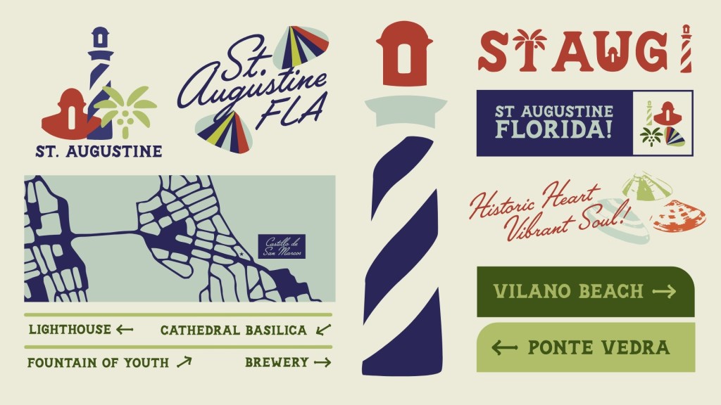
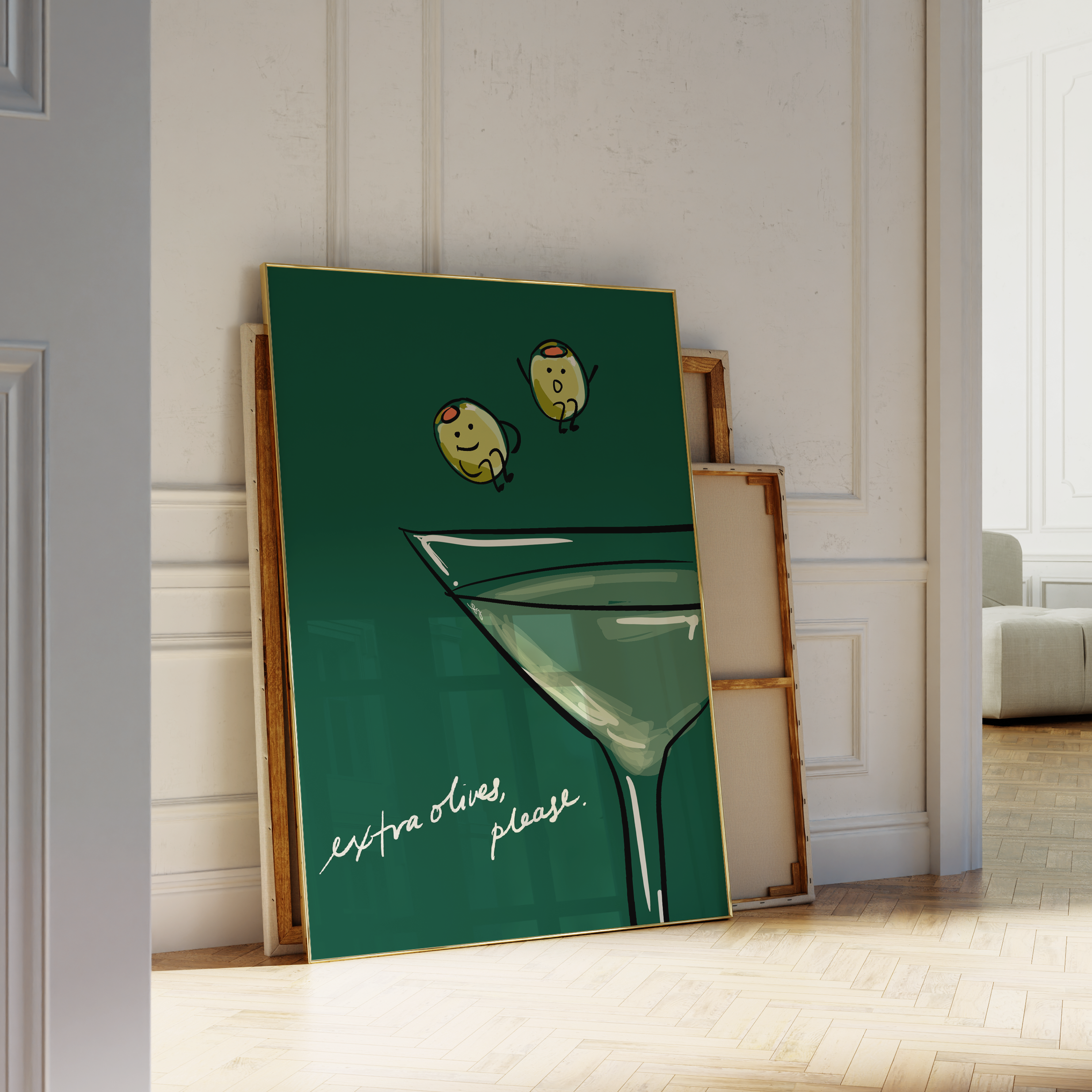
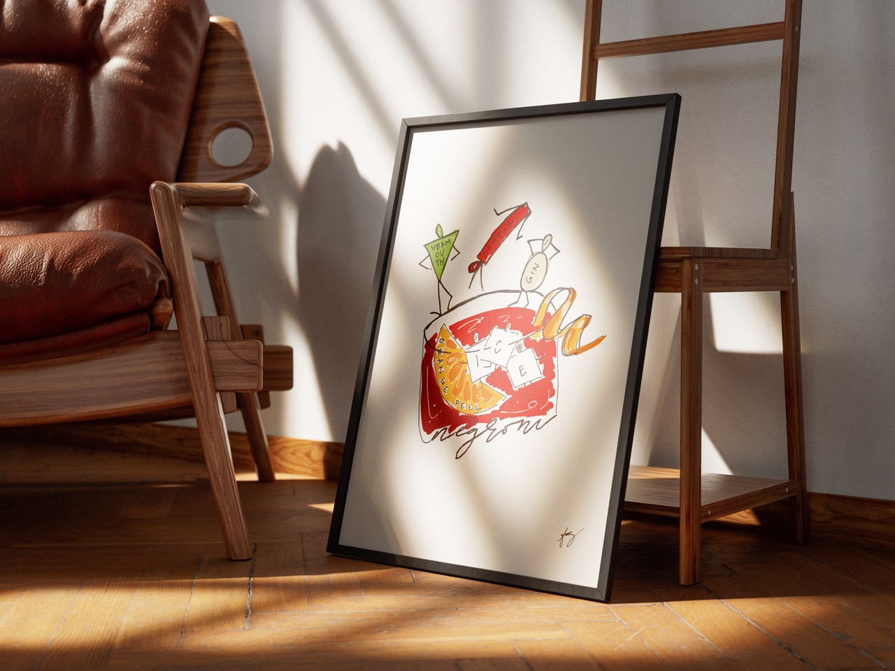
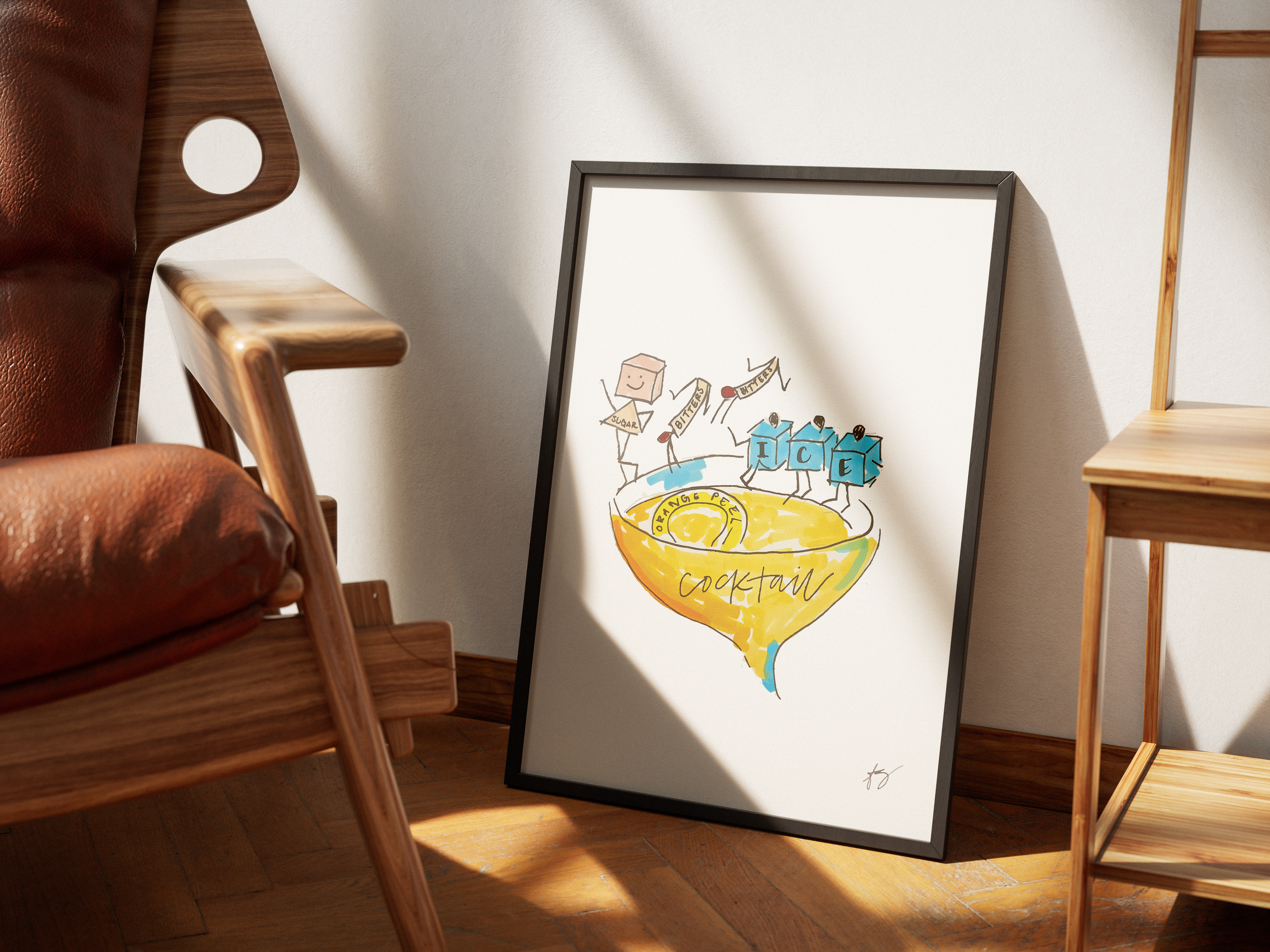
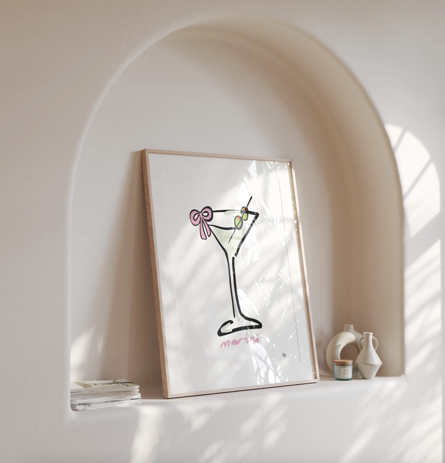
STUDIO FREYA ATHENA
Passion project of fun, eclectic posters I created during winter break in 2023 inspired by my personal collection of vintage advertising. All are available for purchase here: Studio Freya Athena


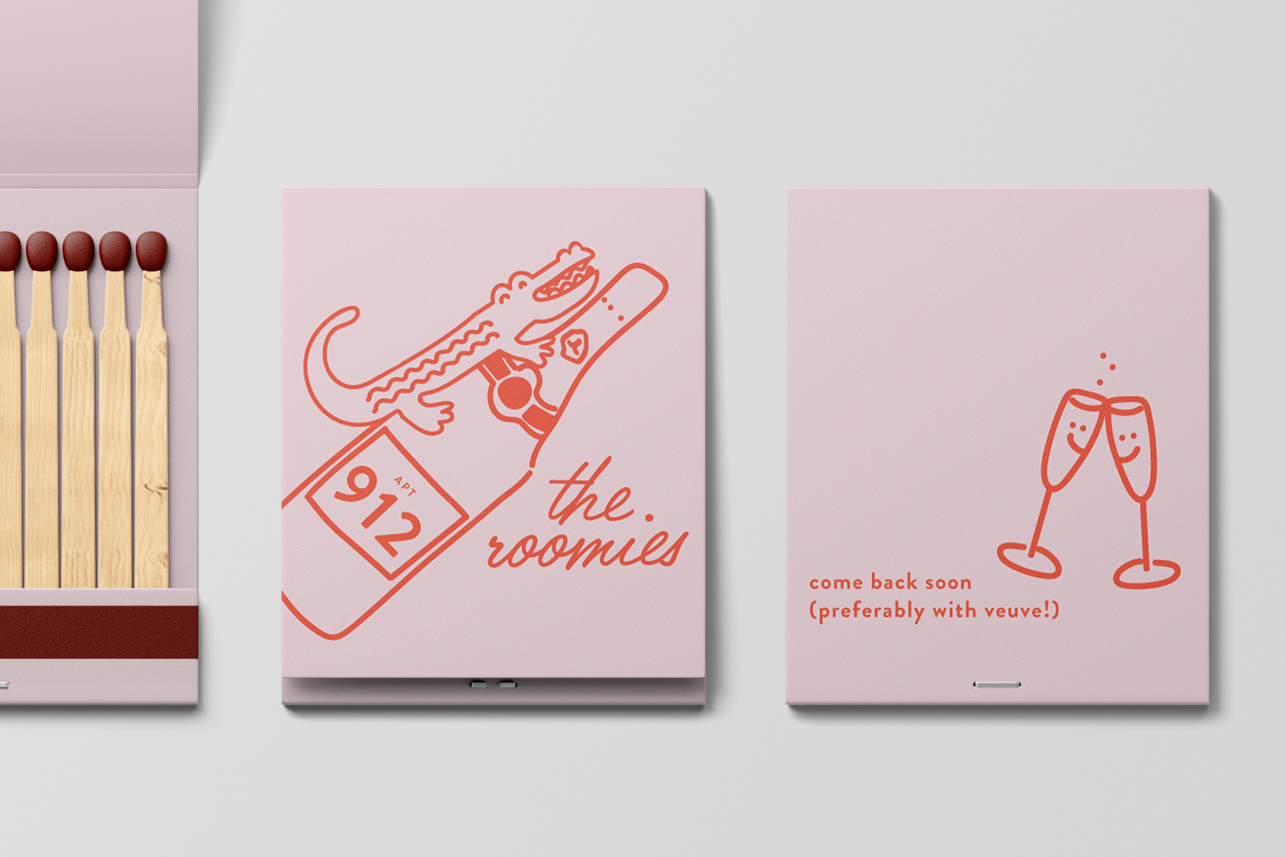
CUSTOM MATCHBOOKS
Created these for my college roommates and I. Currently creating one for each of my favorite restaurants from my hometown, Jacksonville, Florida, and also for my current home – Austin, Texas